
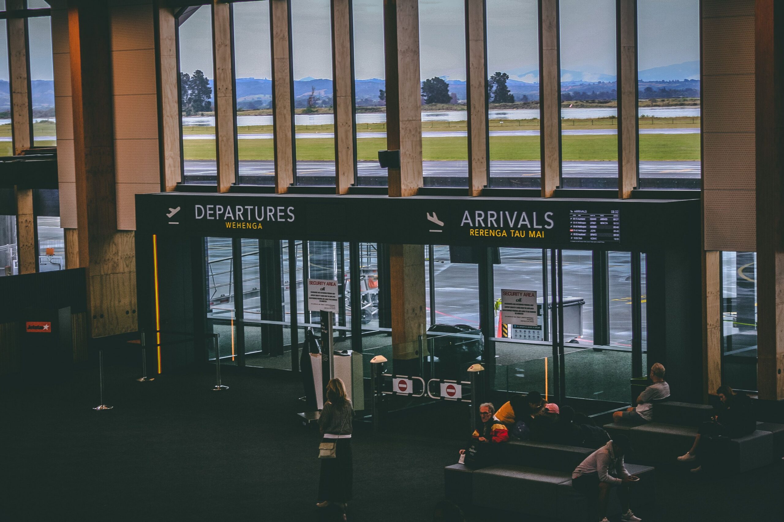
People who work in a building rarely experience its signs in the same way as a visitor. They know which door opens, which corridor turns and what the room used to be called. That familiarity can hide a confusing route until someone unfamiliar tries to follow it.
Choose real visitor journeys
Select a few ordinary tasks: finding reception, reaching a meeting room or returning to the exit. Ask first-time users to follow the intended route and note where they hesitate. Include people with different access and communication needs in an appropriate review process. The purpose is to discover what the environment communicates, not to coach people through it.
Use consistent names and decision points
Check that appointment information, reception instructions, directories and door signs use the same destination names. MBIE’s wayfinding guidance highlights logical circulation and information at decision points. Review the route as a sequence rather than evaluating each sign separately. A clear sign placed after the turn is still too late to be useful.
Avoid solving every issue with another panel
Some problems arise from layout, sightlines or visual clutter. Refer those to the design team instead of continuously adding information to the same wall. Accessibility may require more than visual signs, and emergency signage has its own requirements. Keep the relevant specialists involved. After changes are made, repeat the visitor exercise and remove obsolete information. The result should be a system that helps people move independently and gives staff fewer directions to repeat, without relying on the visitor already knowing the building.