
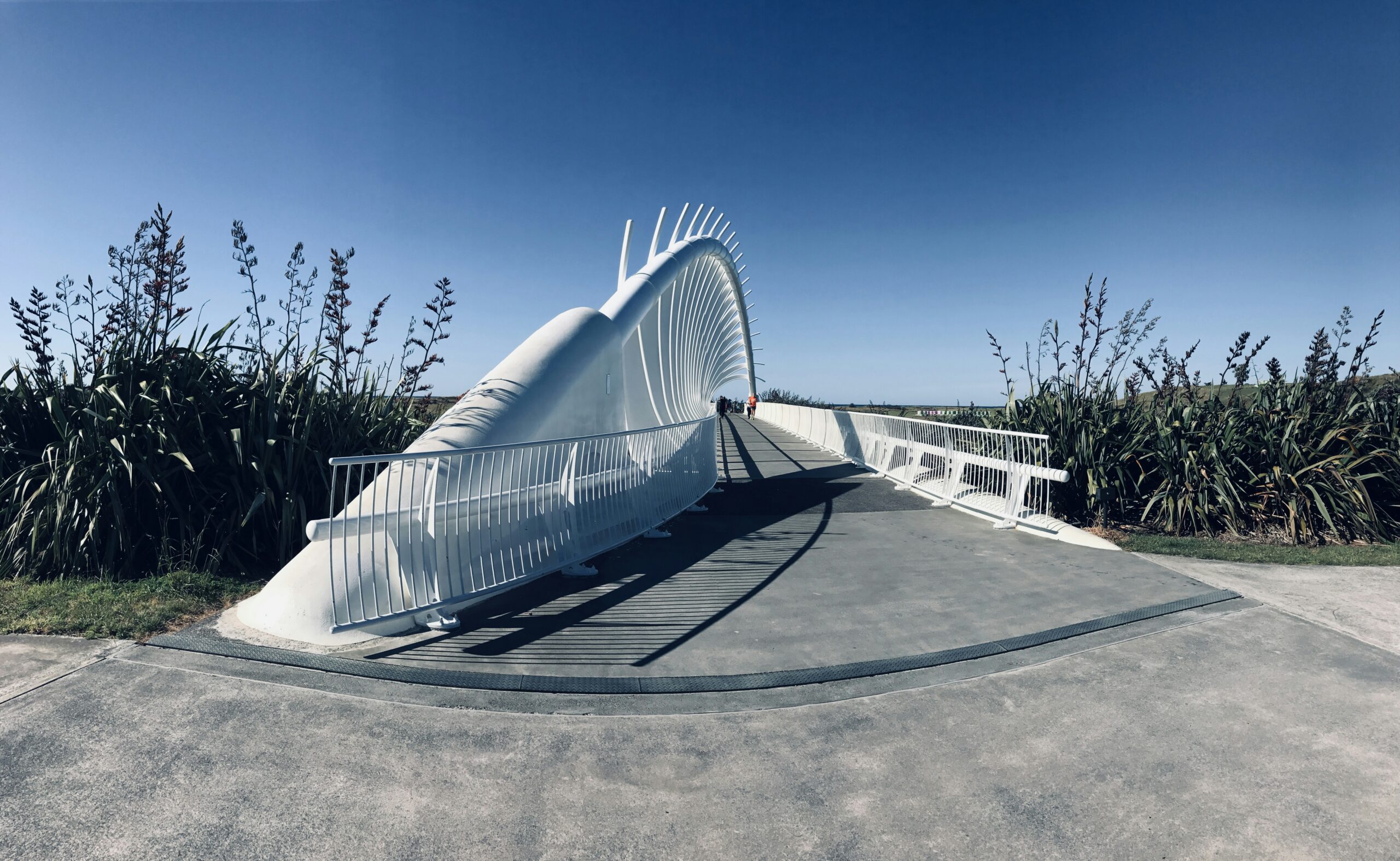
The easiest route through a public space often feels obvious. That apparent simplicity usually depends on careful choices about alignment, views, surface changes and where information appears. A path becomes harder to use when every uncertainty is answered with another sign.
Follow a first-time visitor
Review the route from the points where people actually arrive. Consider someone unfamiliar with the place, someone moving more slowly and someone who needs an accessible route. Note where a decision is required and what information is available at that point. A destination that looks obvious on a plan may be hidden by planting or approached from an unexpected direction.
Coordinate the physical and visual cues
MBIE’s access guidance encourages logical routes and information that supports a range of users. Treat layout, signage and surrounding features as one design task. A sign cannot compensate for an unnecessarily confusing arrangement, and a visually clear route still needs to meet the requirements relevant to its use. Have the appropriate designer resolve accessibility, surfaces, changes in level and other technical details.
Plan for the ordinary day
Think about temporary barriers, maintenance vehicles, events and seasonal vegetation. These can change the route people experience long after the drawings are approved. Ask who will keep information current and how a temporary diversion will remain understandable. During a review, photograph key decision points from a pedestrian’s eye level rather than relying only on aerial views. The goal is not to eliminate signs. It is to make each one more effective because the route itself already makes sense, with clear alternatives and assistance where users need them.